Fundamentals Recap
<link rel="stylesheet" href="<file>.css/>to add CSS to a document- Elements are styled using selectors and combinators:
p,
li {
  /* target elements by kind */
}

.foo {
  /* target elements assigned a class */
}

li.foo {
  /* target elements of a kind assigned a class */
}

li em {
  /* DESCENDANT COMBINATOR: Target elements nested inside another element */
}

li > em {
  /* CHILD COMBINATOR: Target immediate descendants inside another element */
}

h1 + p {
  /* NEXT SIBLING COMBINATOR: Target element that comes after an element but is in the same hierarchy level */
}
- Media Queries: Apply conditional formatting based on viewing conditions such as screen resolution, e.g. :
@media (min-width: 300px) {
  /* only applied when  window is at least 300px wide */
}
-
Pseudo-classes allow application of style based on an element's current state:
:focus- Clicked-on or tabbed-to element:hover- Moused-over:checked- Checkbox/radio button is filled in:first-child- First element of a tag/class within a container:last-child- Last element of a tag/class within a container:first-of-type- First of tag in document:last-of-type- Last of tag in document
-
Pseudo-elements are like pseudo-classes but target sub-elements within an element rather than a specific state. Pseudo-elements do not exist on their own, but are created when they are used in a stylesheet
-
input::placeholder- Placeholder text in an input element -
x::before- Inside x, right before x's content -
x::after- Inside x, right after x's content -
Color formats in CSS:
- Name, e.g.
color: red; - Hex codes, e.g.
color: #FF0000; - HSL (Hue/Saturation/Lightness), e.g.
color: hsl(200deg 100% 50%);- Can add alpha channel value like
color: hsl(200deg 100% 50% / 1);where1represents a fully opaque colour and0represents an invisible colour.
- Can add alpha channel value like
- Name, e.g.
-
Relevant units in CSS:
- Pixels, e.g.
width: 100px; - Ems (relative unit equal to font size of the current element), e.g.
padding-button: 3em; - Rems (relative unit equal to the font-size of the root element), e.g.
font-size: 2rem;. Helpful when you want text to scale consistently - Percentages (relative to parent element), e.g.
.child {width: 50%;} - vw and vh (percentage of the viewport's width and height respectively). Also svw and svh which use the small viewport's dimensions.
- Pixels, e.g.
-
Typography properties:
p {
  font-family: 'Roboto', Arial, sans-serif;
  /* Can be set to specific font or a system-default font like serif or monospace. */
  /* Web fonts imported via HTML should be surrounded in quotation marks */
  /* Multiple fonts can be specified to create a font-stack. The browser will use the first available font. */

  font-weight: bold;
  /* Can also be specified via a numbering system from 1 to 1000 for precise control: */
  font-weight: 300; /* Light, thin text */
  font-weight: 400; /* Normal text*/
  font-weight: 700; /* Heavy, bold text */

  font-style: italic;

  text-decoration: underline;

  text-align: left;

  text-transform: uppercase; /* render in ALL CAPS */

  letter-spacing: 3px; /* horizontal character gap */
  line-height: 1.5; /* vertical distance between lines */
}

nav a {
  text-decoration: none; /* remove underlines from navigation links */
}
Rendering Logic I
- Each browser includes their own user-agent stylesheet, which defines base styles.
- Certain properties are inherited by children.
- You can force a property to be inherited by using the
inheritvalue, e.g.color: inherit;
- You can force a property to be inherited by using the
- When style rules conflict, the rule with the most specific selector will be applied by the browser (from least to most specific: tags, classes, element IDs).
- Documents have two dimensions: Block (perpendicular to the flow of text within a line. vertical in English) and Inline (parallel to the flow of text within a line. horizontal in English)
- Flow-relative logical properties (via Chrome's built-in style for
ptags):
p {
  display: block; /* element will be treated as a block */
  margin-block-start: 1em; /* top margin in English pages */
  margin-block-end: 1em; /* bottom margin in English pages */
  margin-inline-start: 0px; /* left margin in English pages */
  margin-inline-end: 0px; /* right margin in English pages*/
}
The Box Model
- The four 'boxes' of an element:
- Content: Area where your content is displayed. Sized with props like
inline-sizeandblock-size. - Padding: Sits around the content as whitespace. Sized with
paddingand related props - Border: Wraps around content and any padding. Sized with
borderand related props. - Margin: Outermost layer wrapping around content, padding and border as whitespace between one box and other elements. Sized using
marginand related props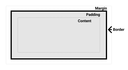
- Content: Area where your content is displayed. Sized with props like
- By default, size properties will set the size of the content box rather than the border box as you may expect. To change this behaviour use this snippet:
*,
*::before,
*::after {
  box-sizing: border-box;
}
- Padding is set via a sequence of unit definitions in the order top -> right -> bottom -> left. With fewer than 4 values the browser will fill in the gaps:
- 1 value: All sides will have same padding
- 2 values: First value will be the padding for the top/bottom, second value will be for the left/right side
- 3 values: Interpreted as 'top, sides, bottom'.
- Borders have 3 styles: width, style (e.g. solid, dotted) and colour. Can be combined into a shorthand like
border: 3px solid hotpink; border-radiusdetermines the radius of rounded corners on the border box. Can be set all at once or per corner e.g.border-radius: 10px 20px 30px 40px(running clockwise from top-left corner)outlineis likeborderbut is a cosmetic effect that doesn't effect layout and can be used as a "second border"- Outlines will follow the curse set with
border-radiusin modern browsers - Outlines have an
outline-offsetproperty that sets a gap between the element and the outline
- Outlines will follow the curse set with
- With
paddingandborderonly positive numbers are supported, butmargincan use negative numbers to pull an element outside its parent- Setting a
margin-leftormargin-rightvalue toautowill cause the margin to take up the maximum possible space. This works for most elements with explicit width.
- Setting a
Flow Layout
- When it comes to layout, CSS is more like a collection of mini-languages than a single cohesive languages. Each HTML element has its layout calculated according to their assigned layout mode, which may be flow, table, positioned, multi-column, flexbox or grid.
- In flow layout, every HTML tag has a default type.
<div>and<header>are block elements,<span>and<a>are inline elements. Type can be toggled using the attributedisplay: {block|inline}; - Inline elements will ignore any properties that would shift elements in a non-inline direction like
height.- Replaced elements like
<img/>,<video/>and<canvas/>are technically inline but can affect block layout.
- Replaced elements like
- Block elements will greedily expand to fill the entire available horizontal space. Even if
widthis set tofit-content, it will not share any inline space. - The browser treats inline elements as if they contain typography. This can result in "magic space" where, for example, images within
<div>elements gain extraline-height. This can be resolved by settingdisplay:blockorline-height:0 - HTML is, to a certain extent, space-sensitive. This can cause issues in the flow layout where whitespace between HTML elements will make images unexpectedly spaced.
display:inline-blockwill make an element behave as a block-level element that can be placed in an inline context. Can use the properties of bothinlineandblockelements.- Keep in mind
inline-blockelements don't line-wrap
- Keep in mind
Width Algorithms::
- By default, width calculations are done looking up the element tree.
- Width algorithms:
auto: context-aware dynamic sizing that will greedily consume available space while respecting viewport constraints. Default value forblockelements.min-content: Element will become as narrow as it can be, based on its child contents. Will add line-breaks to text whenever whitespace or hyphenated words are encountered.max-content: Element will become as wide as possible based on its child components (but does not try to fill all available space). Will never add line-breaks.fit-content: Essentially the same asauto, but with a more descriptive name.
- Width constraints can be added with
min-widthandmax-width
Height Algorithms:
- By default, height calculations are done looking down the element tree.
- Avoid constraining heights, as you don't know how much space an element's content will take up.
- To make an element take up the height of the viewport, either:
- Put
height: 100%on every element before the element and putmin-height: 100%on the element. Or, - Put
height: 100svhon the element (orheight: 100vhfor older browsers)
- Put
Margin Collapse
- In certain situations margins can "collapse" and overlap.
Rules of Margin Collapse
- Only block-level margins collapse.
- Margins only collapse in Flow layout.
- Margin collapses will be blocked by:
- Elements between siblings (e.g a line break between two elements with margins)
- Padding and borders
- Gap created by a
min-heightattribute.
- The bigger margin wins (i.e. the effective margin between two elements of different sizes will be the size of the larger margin). This is also true for negative margins (e.g. -32px will win over -16px).
- Nesting doesn't prevent collapsing. Margins are meant to increase the distance between siblings, not the gap between a child and its parent's bounding box (which is what padding is for). Margin will always try and increase distance between siblings even if it means transferring margin to the parent element.
- Overlapping elements can collapse in the same direction
- More than two margins can collapse
- Negative and positive margins will share a space equal to the sum of their margin sizes (e.g -25px + 25px = 0px collapsed).
Using Margin Effectively
- Avoid using margin on something at the component boundary
- Use layout components to group components with margin properties
Rendering Logic II
- Positioned Layout: Layout that allows items to overlap.
- Opt into positioned layout by using the
positionedproperty, which can be set torelative,absolute,fixedorsticky. Settingpositionedtostaticorinitialwill opt out of positioned layout.
- Opt into positioned layout by using the
Relative Positioning
- Relative is the most subtle Positioned sub-layout, as it doesn't effect the layout of sibling elements. Does two things:
- Constrains certain children
- Enables additional CSS properties to be used
- The additional CSS properties used includes
top,left,rightandbottom. These are directional values which can be used to shift the element around relative to its natural position. Can be set to negative values. - Relative positioning can be applied to both block and inline elements, allowing us to nudge inline elements in a way that isn't really possible otherwise.
Absolute Positioning
-
Absolute Positioning allows you to position elements wherever you want. Use it for:
- UI elements that need to float above the UI like tooltips or dropdowns
- Decorative elements that need to be stuck in certain positions
- Stacking multiple elements in the same place, like a deck of cards
-
Enables the use of the edge properties
top,left,rightandbottom, which specify the distance it should be from each edge of the viewport -
If you don't give an absolute element an anchor it will sit in its default in-flow position.
-
When you set an elements
positiontoabsolute, it is pulled out of the flow. When laying out elements, the browser effectively pretends absolutely-positioned elements don't exist. -
If an element is positioned to be equidistant from each side but has been given a specific side, it will prioritize adhering to the
topandleftproperties -
Setting
margin: autowill make an element center itself in the viewport. This requires absolute positioning, equal distances from each edge and a fixed size. -
The
insetproperty will set all 4 edge properties to the provided value. -
*Containing Blocks**: Absolute elements can only be contained by other elements using Positioned layout. When deciding where to place an absolutely-positioned element, it crawls up the tree to try and find a Positioned ancestor. The first one it finds will provide the containing block, and will be positioned according to its edges ignoring padding.
Stacking Contexts
- Default layering:
- When all siblings are rendered in Flow layout, the DOM order controls how the background elements overlap, but the content will always float to the front
- If one sibling uses positioned layout, it will appear above its non-positioned sibling, no matter what the DOM order is.
- If both siblings use positioned layout, the DOM order controls which element will be on top. Unlike in Flow layout, the content does not float to the front.
z-index: Override default layering behaviour by assigning elements values on the z-axis (i.e. up/down). Higherz-indexvalues are placed closer to the viewer in 3D space.- Negative
z-indexvalues can just confuse things.
- Negative
- Stacking Contexts: If an element is assigned a
z-index, a stacking context is created for its children.z-indexvalues will be relative other values inside the parent element, not relative to all elements in the document.- Think of it in terms of versioning. If a parent element has a
z-indexof1and a child element inside it has az-indexof99999, think of it's true index as1.99999. No matter how high thez-indexof the child element is, it will never be layered above an element that is a sibling of the parent with az-indexof2.
- Think of it in terms of versioning. If a parent element has a
- Things that create stacking contexts:
- Setting
opacityto a value less than1 - Setting
positiontofixedorsticky - Applying a
mix-blend-modeother thannormal - Adding a
z-indexto a child inside adisplay: flexordisplay: gridcontainer - Using
transform,filter,clip-pathorperspective - Explicitly creating a context with
isolation: isolate
- Setting
- Stacking contexts can be inspected and debugged using CSS Stacking Context Inspector.
- Strategies for reducing
z-indexwars:- Use DOM order instead (best used on non-interactive elements, as changing DOM order also changes their order in the tab index).
- Create isolated stacking contexts using
isolation: isolate. Flattens thez-indexof child elements without requiring parent elements to have az-index.
Fixed Positioning
- Fixed Positioned elements can only be contained by the viewport and are immune to scrolling. Perfect for overlays like modals.
- Fixed positioning is incompatible with certain CSS properties. If an ancestor element used the
transform,filterorwill-changeproperty it will behave like an absolute positioned element. Fix this by either removing/replacing the ancestor's CSS property or use a portal component.- To find a culprit ancestor element, run the following snippet in your browser console (ensure you've selected the correct environment if the page uses iframes):
// Replace “.the-fixed-child” for a CSS selector
// that matches the fixed-position element:
const selector = '.the-fixed-child';

function findCulprits(elem) {
  if (!elem) {
    throw new Error(
      'Could not find element with that selector'
    );
  }

  let parent = elem.parentElement;

  while (parent) {
    const {
      transform,
      willChange,
      filter,
    } = getComputedStyle(parent);

    if (
      transform !== 'none' ||
      willChange === 'transform' ||
      filter !== 'none'
    ) {
      console.warn(
        '🚨 Found a culprit! 🚨\n',
        parent,
        { transform, willChange, filter }
      );
    }
    parent = parent.parentElement;
  }
}

findCulprits(document.querySelector(selector));
Overflow
- Overflow is a condition that happens when content doesn't fit into its parent's content box. To choose how to manage overflow situations, set the property
overflowto one of the following values:visibleallows an element's contents to extend beyond its bounds. Default behaviour in overflow situations.scrolllets users scroll through the content inside the element (adds a scroll bar).autoonly makes an element scrollable if the contents inside don't fit.hiddentruncates all content that extends beyond the bounds of the container. Essentially creates a scroll container but without a scroll bar. If the content contains focus-able elements users can tab through them to scroll through the hidden content.cliptruncates content that extends beyond the bounds of the container without creating a scroll container. As of November 2022, around 20% of users were using browsers that don't supportoverflow: clip. If the content contains focus-able elements, users can tab through them and eventually lose the focus indicator.
- To manage both vertical and horizontal overflow, use
overflow-yandoverflow-xrespectively.overflowis essentially a shorthand that sets both properties to the same value.- To make only one side (vertical or horizontal) hidden, create a wrapper class and set
overflow-y: hiddenoroverflow-x: hidden
- To make only one side (vertical or horizontal) hidden, create a wrapper class and set
- To instruct a container to not linewrap for overflow content, set
white-space: nowrap - Overflow settings only apply to positioned children if their parent is also positioned.
- Fixed-positioned elements are immune from being hidden with
overflow:hidden
Sticky Positioning
- Sticky Positioning: As you scroll, an element can "stick" to the edge. The moment the element reaches the edge of the viewport it transitions from being relatively-positioned to being fixed-positioned.
- Sticky elements only stick while their container is in view.
- Edge properties can be set on sticky elements to define how far the element can be from the edge of the viewport before it starts to stick. Can be set to negative numbers.
- Sticky elements take up space in the initial layout. Even when the element is stuck to the edge during scrolling the space remains and overall layout is unaffected.
- Common reasons an element won't stick:
- A parent is hiding/managing overflow
- The container isn't big enough
- The sticky element is stretched
- If there's a thin gap above your sticky header, it may be due to a rounding issue with fractional pixels. Solve it with
<edge>: -1px.
Hidden Content
display: nonevisibility: none: Useful when you want visibility to be selectively undone by children. Undo usingvisibility: visibleopacity: 0: Use when an item needs to be semi-visible, or an item's visibility needs to animated. Elements with 0 opacity are still interactive.- To make an element hidden from screens but still discoverable for people using screen readers, use this snippet:
.visually-hidden {
  position: absolute;
  overflow: hidden;
  clip: rect(0 0 0 0);
  height: 1px;
  width: 1px;
  margin: -1px;
  padding: 0;
  border 0;
}
- To make an element hidden from screen-readers but visible on screens set the
aria-hiddenattribute totrueon the HTML element. To indicate to screen readers that they should ignore interactive content add theinertattribute as well.
Modern Component Architecture
CSS Ecosystems
Vanilla CSS
- PROS
- No tooling means less complexity, no runtime performance costs
- Modern CSS features like CSS custom properties make certain tooling features (eg. Sass variables) redundant
- CONS
- Global and unscoped. The CSS you write in one place will be applied everywhere. Using a naming convention like BEM can help, at scale naming collisions are still possible.
- Requires that you remember to add vendor prefixes for many CSS properties to ensure optimal browser support
- Can't share data easily between CSS and JS
- Made for documents, not apps. Awkward to use in modern JS application development.
Sass
- Sass is a preprocessor that compiles to vanilla CSS that extends CSS with features like nesting, variables and iteration.
- PROS
- Includes powerful tools like for-loops, mixins and nesting
- High developer satisfaction compared with vanilla CSS
- CONS
- Requires a build step
- Remains global by nature and isn't scoped to specific components.
- As everything happens at build time, you can't react to things in real-time, so Sass variables are nowhere near as powerful as CSS variables.
- Requires native dependencies that can fail or get out-of-date.
- Naming clashes with CSS
- Is becoming less popular in the JS scene
Aphrodite
- Aphrodite is a React-Native-like styling solution to he web. Styles are written in JS and used by React components.
- PROS
- No more scoping and specificity issues.
- Allows you to use JS within your CSS, making it easy to share state and also allows for complex iteration and generation without the need to learn a new Domain-Specific Language (DSL) as you would with Sass
- Encourages good habits (no support for nesting)
- Automatically adds vendor prefixes
- Similar API to React Native makes it easy to move between projects or possibly port components between them.
- No need to tab between files when working with files and JSX
- CONS
- Requires a build step
- High-friction
- Has a cost in terms of bundle size and runtime execution time
- Styles must be written in JS. Property names are camelCased, values must be quoted.
- Writing global styles is unintuitive
- Not a very active project
CSS Modules
- CSS Modules is a tool that allows you to write vanilla CSS and import it into a JS file.
- PROS
- No more scoping and specificity. Classes you write will be globally unique, even if a different CSS file has a class with the same name.
- Feels like writing normal CSS
- Offers a
composesfeatures, to extend existing CSS classes
- CONS
- Doesn't really offer any modern convenience features like autoprefixing
- Hard to share data between CSS and JS
Single-file components are a way to create scoped CSS in the same file as your component definition offered by Vue and Svelte.
styled-components
- styled-components are a CSS-in-JS solution, where every style is a React component
- PROS
- Solves scoping and specificity in a way that fits well with component-driven architectures.
- Feels like writing CSS with some quality-of-life improvements borrowed from Sass.
- Offers good solutions for animations and global styles
- High developer satisfaction
- Highly performant
- Currently the most popular CSS-in-JS solution
- CONS
- Requires a build system
- Primary a React tool
- Obfuscates the underlying markup tags, which can make it harder to get a sense of the HTML semantics at a glance
- Emotion is a similar solution with largely the same API.
Tailwind
- Tailwind is a utility-first CSS framework (utility meaning a short CSS class that maps to specific styles).
- PROS
- Solves scoping and specificity
- Includes built-in tokens which can make it easier to come up with a nice design
- Can be faster to write
- Not React-specific
- Has exploded in popularity recently, meaning better community support
- CONS
- Relatively steep learning curve compared to other tools
- Because not all CSS can be turned into utilities, you'll likely need a secondary system for writing traditional CSS.
- Adds a lot of hard-to-read "bulk" to your markup if many classes are required.
styled-components 101
- styled-components uses tagged template literals. To create a style, call the method for the HTML tag you're using on the
styledobject imported fromstyled-components, e.g.
import styled from 'styled-components';

const Button = styled.button`
  display: flex;

  /* & will be automatically replaced with a unique vendor prefix */
  &:hover {
    color: red;
  }
`;
- The above statement produces the following CSS:
.abc123 {
  /* Vendor prefixes for legacy browsers: */
  display: -webkit-box;
  display: -webkit-flex;
  display: -ms-flexbox;
  display: flex;
}

.abc123::hover {
  color: red;
}
styledhas methods for every HTML tag typically used within the <body>- Once a style has been declared, style a component by wrapping the body of the tag in the style component, e.g.
<div><StyledDiv>{children}</StyledDiv></div> - Styles can also be written by passing a string of css to the
cssprop. Requires importing (babel-plugin-styled-components) - To create global styles:
import { createGlobalStyle } from 'styled-components';

const GlobalStyles = createGlobalStyle`
  /* ...css... */
`

function App() {
  return <>
     // ..JSX...
     <GlobalStyles/>
  </>
}
- To create dynamic styles, either use CSS variables (covered later in the course) or pass in values as props:
const Button = ({ color, onClick, children }) => {
  return (
    <Wrapper onClick = {onClick} style = {{ color }}>
      {children}
    </Wrapper>
  );
}

const Wrapper = styled.button`
  color: ${props => props.color}; // used color passed as prop
  padding: 16px 24px;
`
- To create component variants:
// Assume FillButton, OutlineButton, GhostButton have been written or imported in this file

const Button ({ variant, size, children, className }) => {
  const styles = SIZES[size];

  let Component;
  switch(variant) {
    case "fill":
      Component = FillButton;
      break;
    case "outline":
      Component = OutlineButton;
      break;
    case "ghost":
      Component = GhostButton;
      break;
    default:
      throw new Error(`Unrecognized Button variant: ${variant}`);
  }

  return (
    <Component style={styles} className={className}>
      {children}
    </Component>
  )
}
- Inversion of control nesting is a way of allowing components to take on different styles in different contexts without needing to define variants. Good for ensuring each component has a single source of styles. eg.
const TextLink = styled.a`
  /* Standard styles: */
  color: blue;
  text-decoration: none;

  /* Styles when rendered inside a quote: */
  ${QuoteContent} & {
    color: black;
    text-decoration: revert;
  }
`
Building Component Libraries with styled-components
-
Component Library: Collection of generic, reusable components that can be dropped in to multiple applications. Ensures consistency between products and can help boost new development speed as you don't have to build everything from scratch.
-
Design system: Like a component library, but made up of a collection of vector graphics instead of components.
- Also consists of design tokens, specifying values for scales for sizes or colours.
-
Components can be composed like so:
const Base = styled.button`
  font-size: 21px;
`;

const PrimaryButton = styled(Base)`
  background: blue;
  color: white;
`
- The
asprop can be used to dynamically change the tag that styled-components renders, eg.
function Button({ href, children }) {
  return (
    // Despite 'wrapper' being set up as a button component, "as" makes sure React renders it as an anchor instead without changing its appearance on the page
    <Wrapper as="a" href={href}>
      {children}
    </Wrapper>
  )
}

const Wrapper = styled.button`
  /* ..CSS.. */
`
- Escape Hatches are tools that allow developers to break free of constraints that are usually good to have around.
- When building reusable components, it should be easy to follow the convention, and hard (but possible) to break free of it.
- For commonly used components/component variants the API should be very simple. Creating one-off special components (eg. themed component variants used on certain holidays) should be possible, but be a higher-friction process.
Flexbox
- Flexbox is a CSS layout mode that is handy when you have a set of elements and you want to control their distribution along a primary axis either horizontally or vertically.
- If you want to control distribution of elements across two dimensions use CSS grid. Flexbox is more suited to single dimension distribution.
- Toggle on for an element's children by applying
display: flex
- Works across two axes. Elements are distributed across the primary axis (set with
flex-direction) and greedily stretch to fill space in the perpendicular cross axis flex-directionsets the primary axis for flexbox elements, the axis that elements will be distributed across (eitherroworcolumn). The other axis becomes the secondary/cross axisjustify-contentconfigures layout in regards to the primary axis. Values:flex-start- Pack items at start of primary axisflex-end- Pack items at end of primary axiscenter- Pack items at center of primary axisspace-between- Distribute elements evenly across the entire primary axis by putting gaps between themspace-around- Distribute elements evenly across the primary axis by putting gaps between elements, with half gaps at the start and endspace-evenly- Distribute elements across the primary axis by putting gaps between elements and at the start and end
align-itemsconfigures layout in regards to the cross axis.stretch- Auto-sized items will enlarge to fill their containerflex-start- Align items against the start of the axisflex-end- Align items against the end of the axisalign-items- Center items within axisbaseline- Align the bottom of each element with each other
align-selfallows a child to have a specific alignment
Growing and Shrinking
- There are two important sizes when dealing with Flexbox:
- Minimum content size is the smallest an item can get without its contents overflowing
- Hypothetical size is the value set with
flex-basis, or withwidthfor flex rows andheightfor flex columns (flex-basistakes precedence)
flex-growsets the ratio of available space children are allowed to consume in a container. Default is 1. Higher values let elements consume more space from other elements.flex-shrinksets the ratio of available space other items can consume. Cannot be used to shrink an item below its minimum content size. Default is 1, higher values let other elements consume more space from the set element- Setting
flex-shrinkto0ensures an element's space will never be consumed by other elements
- Setting
flexworks as a shorthand for assigning flex values.flex: <flex-grow-val> <flex-shrink-val> <flex-basis-length>- A very common gotcha is that when you use this shorthand without assigning all values
flex-basiswill be by default set to0which overrides any width you set.
min-width/min-height/max-width/max-heightcan be used to clamp growth of elements
More on Flexbox
flex-wrap, when set towrap, will enable line-wrapping of flow elements if their container's size falls below itsflex-basisvalue.gapwill set a gap between flex elements, regardless of grow/shrink rules in place- Direction is usually dictated by DOM order, but the flexbox layout can change the visual order by setting
flex-directiontorow-reverseorcolumn-reverse
Layout Interactions
- When there's a conflict between layout modes, positioned layout will always win out. Flexbox containers with positioned children will behave as if they didn't have those children (😔)
- As a general rule, elements can't participate in multiple layout modes at once
- Exceptions include relative and sticky positioned elements, as they inherit the origin points from their layout contexts